Luxury & Fashion5 weeks
Elevating Business with Luxury Data Visualization: Kering's Transformation
Enhance your financial data with visualizations that are as elegant as they are accurate.
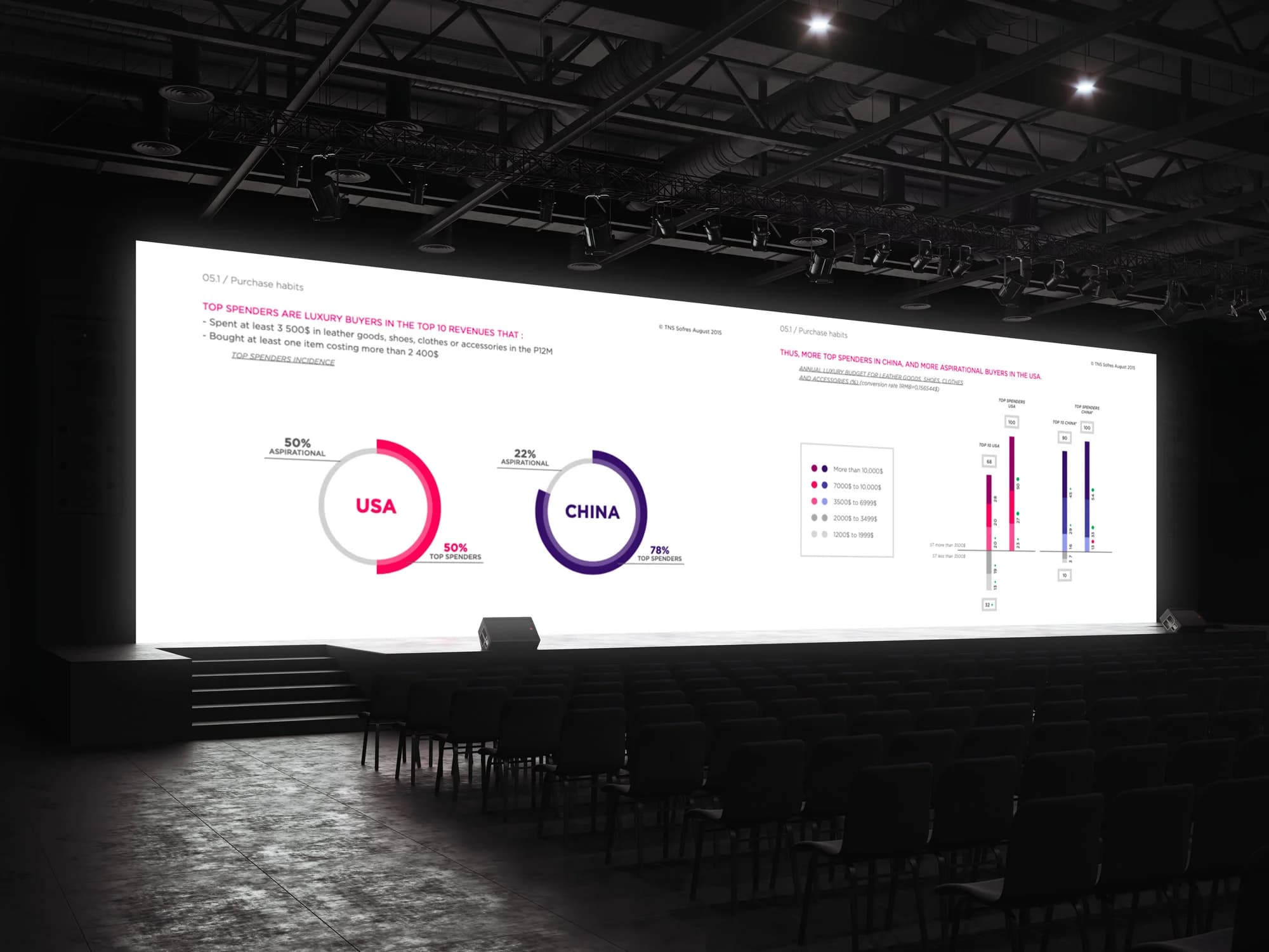
Presenting financial data in the luxury sector requires a perfect combination of elegance and precision. Our collaboration with Kering is reinventing the codes of corporate communication.
Project Details
- Client
- Kering
- Duration
- 5 weeks
- Industry
- Luxury & Fashion
Services
Decision-making interfaceData VisualizationData Reports
Case Study
Project Deep Dive
01
The Challenge
Kering was looking for a major transformation:
- Visuals aligned with the identity of the group
- An impacting financial data narration
- A balance between aesthetics and precision
02
Our Approach
We have developed:
- Customized visualizations that respect luxury codes
- A clear and sophisticated narrative structure
- A perfect integration of graphic standards
03
The Results
The transformation delivered:
- A visually distinctive business report
- An engaging presentation for shareholders
- Optimal valorization of strategic data
This achievement illustrates how expert data visualization can transform complex data into impactful communications, respecting the highest standards in the luxury sector.